We have created a list of best, top 5 mobile site, smartphone website HTML5 templates. By using these website HTML templates you can create cell phone site, touch optimized smart phone site, responsive mobile version of your main site, iPad sites, tablet sites, iPhone sites, android site, blackberry sites and any other types of mobile websites.
Here is the list of top 5 mobile site, smartphone website HTML5 templates:
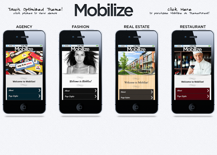
1) Mobilize HTML5 Template: Mobilize template is a responsive mobile site HTML5 template which comes with 4 types of mobile site layouts. It is the best, most popular, premium and top selling mobile site HTML5 template.
Features:
- Responsive mobile site HTML5 template.
- 4 types of mobile site layouts including agency mobile site, fashion mobile site, restaurant mobile site and real estate mobile site.
- 4 types of page layouts including page with one column, page with 2 columns, page with 3 columns and page with no banner.
- 24 types of effects for the homepage slider.
- Multiple types of searchable lists including events style list, events style list insert, thumbnail list, thumbnail list insert, numbered list, numbered list insert, regular list and regular list insert.
- Multiple types of panels including open panels with events, open panels with thumbnails, open panels with list, right open panels, regular open panels, overlay open panels and push open panels.
- Multiple types of page transitions including slide down, slide up, slide, slide fade, fad, pop, flip, turn and flow transition effect.
- Supports sticky footer, Google fonts, portfolio and modal windows.
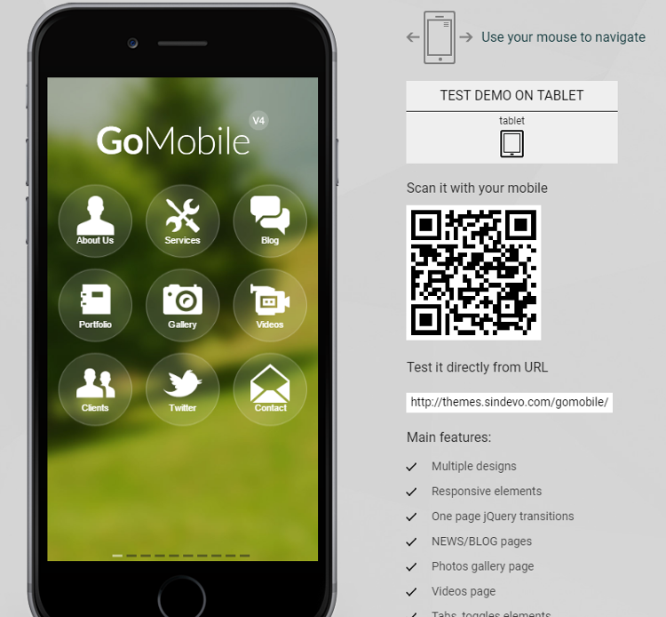
2) Go Mobile HTML5 Template: Go Mobile template is a responsive smartphone site HTML5 template which comes with 14 types of mobile site layouts.
Features:
- Responsive smartphone site HTML5 template.
- 14 types of mobile site layouts including mobile site with white layout, mobile site with wedding layout, mobile site with medical layout, mobile site with beauty layout, mobile site with gradient layout, mobile site with intro layout, mobile site with slider layout, mobile site with business layout, mobile site with metro layout, mobile site with green layout, mobile site with main layout, mobile site with food layout, mobile site with black layout and mobile site with red layout.
- 3 types of photo galleries.
- Supports YouTube videos, self hosted videos, vimeo videos and audio files.
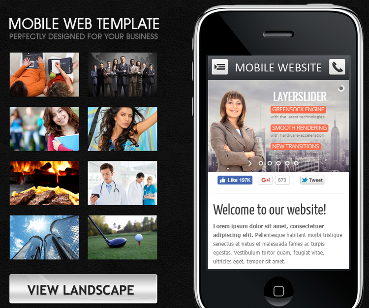
3) Mobile & Tablet HTML5 Template: Mobile & Tablet template is a responsive cell phone site HTML5 template which comes with 3 types of portfolio page layouts.
Features:
- Responsive cell phone site HTML5 template.
- 3 types of portfolio page layouts.
- Multiple types of sliders including basic carousel, carousel with minimum and maximum images, thumbnails slider, layer slider with parallax effect, slider with fade animations, slider with vertical slide animations, slider with horizontal slide animations and slider with thumbnails controlled navigation.
- Built by using HTML5 and CSS3.
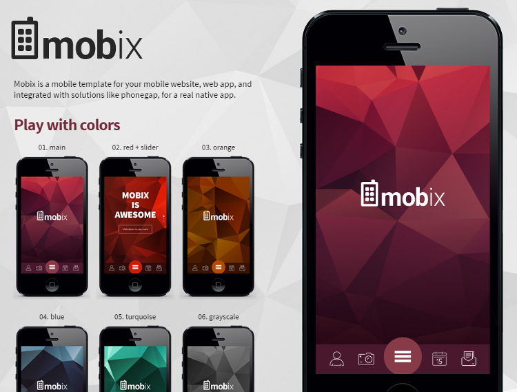
4) Mobix HTML5 Template: Mobix template is a responsive mobile phone site HTML5 template which comes with 6 types of color schemes.
Features:
- Responsive mobile phone site HTML5 template.
- 6 types of color schemes including red, maroon, gray scale, turquoise, blue and orange.
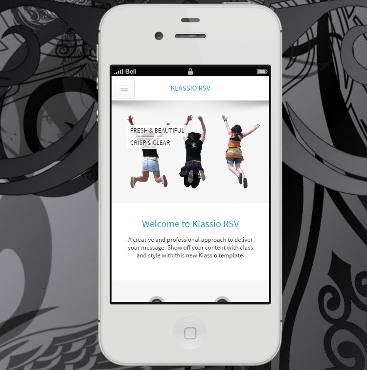
5) Klassio HTML5 Template: Klassio template is a responsive and retina ready smartphone site HTML5 template.
Features:
- Responsive and retina ready smartphone site HTML5 template.
- 4 types of light color schemes and 4 types of dark color schemes.